Now the center pane is green. Is that true or am I turning reptilian.
I am running on minimum drivers on this machine which could affect my video card.
Need opinions on new web site
-
Grandma Ruth
- CEO
- Posts: 1237
- Joined: Mon Nov 13, 2006 7:17 am
- Location: West Yorkshire, England
- Contact:
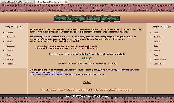
It's looking good! Two things I don't like so much - the colour of the banner at the top and bottom, which comes out as a sort of dusky maroon on my computer, and the black shadow around "North Georgia Dining Reviews". I would have something in the pale blue/green spectrum for both these, maybe - liven it up a bit.


-
Grandma Ruth
- CEO
- Posts: 1237
- Joined: Mon Nov 13, 2006 7:17 am
- Location: West Yorkshire, England
- Contact:

A couple of quick comments:
The headings for the left and right panels seem dull, written as "Navigation by Type" etc. I would use "Georgia Cities" (or "Restaurant Location") and "Type of Cuisine" instead, less generic-sounding.
All the text is about the same size. You should add a few eye-grabbers that are much larger fonts. As an example, the first paragraph could be preceeded by a funky, playful headline font that just says "Why?" and then the second paragraph could have "How?" before it. An alternative would be to drop in catchy dining images in those same locations.
The top banner is underwhelming to me. The background is too flat, especially when it stretches out to fill a wide screen like mine. What I did on my own web page was to use a gradient of color, in which the edge and the center weren't all that different (in my case, it's dark red that goes from unsaturated to saturated, or greyish to more pure red). If you can do something similar it would help here; the solid colors elsewhere are fine. Perhaps a gradient from the background colors of your side panels to the background color of the center panel.
Also, I would be inclined to do all the text in the center panel as center-aligned, not left-aligned.
I would agree with others that have voiced a desire for a "cool color", like a blue-green, to offset all the red/orange/tans. I'd be inclined to color the actual letters in your top banner with a muted slate green or copper patina... and I know you've said you don't go by color names! I'll try to give you a bit more help than this if you want.
=Winchester, Paston & Portsmouth=
====== We Provide Pride! ======
====== We Provide Pride! ======
Good ideas. I'm curious though, are you going by the screenshots or did you go to the link about 9 posts up? Reason I ask is that I've already changed 'Navigation by Type' to 'Navigation by Cuisine'. There's been a few other changes since I took that screenshot too. I do like your ideas though. :)WPandP wrote:A couple of quick comments:
The headings for the left and right panels seem dull, written as "Navigation by Type" etc. I would use "Georgia Cities" (or "Restaurant Location") and "Type of Cuisine" instead, less generic-sounding.
Actually I'm just concentrating on the layout and color scheme right now. Once I get that set I'll work on the content more. Right now the text is just filler and I'll be making a lot of changes on it.WPandP wrote:All the text is about the same size. You should add a few eye-grabbers that are much larger fonts. As an example, the first paragraph could be preceeded by a funky, playful headline font that just says "Why?" and then the second paragraph could have "How?" before it. An alternative would be to drop in catchy dining images in those same locations.
Matter of fact, some of your ideas just might come into play.
I plan on adding pop-out (drop-down) menus to both sets of nav links so that hovering over a city will show the cuisine in that town and hovering over a cuisine will show a selection of cities. I just haven't got around to it yet.

I know that search engines use the first few lines of text on a site in the description so I want to have something there to catch folks eyes.
I agree with your ideas here too. Problem is, I'm working with a new style of design (code) and using images really screws things up.WPandP wrote:The top banner is underwhelming to me. The background is too flat, especially when it stretches out to fill a wide screen like mine. What I did on my own web page was to use a gradient of color, in which the edge and the center weren't all that different (in my case, it's dark red that goes from unsaturated to saturated, or greyish to more pure red). If you can do something similar it would help here; the solid colors elsewhere are fine. Perhaps a gradient from the background colors of your side panels to the background color of the center panel.
This code I'm working with is designed to adjust according to the visitors screen res. without loosing the format.
I would like to use a gradient image in the header but then it will be set in stone and the whole concept of the liquid layout goes out the window. Maybe I can figure out a way to resize an image.
The banner text is an image but I've managed to get it to stay in place in the center at different screen resolutions, but a full width image I don't think will work right.
I'm trying to eliminate the the nasty horizontal scroll bar, no matter what screen res the visitor uses. So far it's working great but a full width image wouldn't work right.
If you drag the bottom-right corner of your browser and make the screen smaller you'll see what I mean. It is similar to your site so I guess you can see where a full width image would cause problems.
As I mentioned in an earlier post, I've only been working with css for about 4 months so there are some techniques that I'm not knowledgeable of yet. If you have any tips, I'm all ears (or eyes-as the case may be :) )
Ya' know, I generally do that but this time I decided to try left-align. I'll try center and see what it looks like.WPandP wrote:Also, I would be inclined to do all the text in the center panel as center-aligned, not left-aligned.
Green is really not one of my favorite colors but that copper patina sounds good, whatever that is.WPandP wrote:I would agree with others that have voiced a desire for a "cool color", like a blue-green, to offset all the red/orange/tans. I'd be inclined to color the actual letters in your top banner with a muted slate green or copper patina... and I know you've said you don't go by color names! I'll try to give you a bit more help than this if you want.
Thanks for taking a look and your comments. Greatly appreciated. :D
Hawk
-
thegrindre

- Engineer
- Posts: 792
- Joined: Fri Nov 10, 2006 11:33 pm
- Location: Central Arkansas
Another point I should bring up, and I'm not making excuses; The clientèle I'm looking for would be the average Dick & Jane that live close enough by to make use of the site. A lot of these folks are probably still running at 800 X 600, and then some may even be running at 1600 X 1200, so I'm trying to accommodate all aspects of the viewing audience.
Traffic at this site will mostly be run in-run out. There most likely won't be a lot of lingering, not to mention there's a good chance that a lot of them will still be on dial-up so I want the site to load fast for them as well.
It's a bit different than a gaming site and I'm trying to design with that thought in mind.
I would like to pizazz it up a bit but not too much that it will affect dial-uppers.
Does that make any sense?
Hawk
-
Grandma Ruth
- CEO
- Posts: 1237
- Joined: Mon Nov 13, 2006 7:17 am
- Location: West Yorkshire, England
- Contact:
Screen resolution here is 1024 x 768 - don't know what it is at work but I'm seeing the same colours here and there! This screen is an old monitor 28cn x 20cm - the one at work is a fairly new flat screen somewhat bigger than this one. I don't understand the other questions but I'm pretty sure the answers will be different for home and work and I still see maroon - OK 

The size of the site is perfect for a 1024 x 768 resolution, and that's the most widely used resolution so don't worry about that Hawk, you're spot on. Font size also perfect
It's funny how everyone's seeing different colours on their monitors, lots of uncalibrated monitors out there. The tiles on the top could be a photo rather than an illustration. Look at the free photo website http://www.morguefile.com/ where you can use it’s photos on websites for free (most of the time).
Once again it’s a very dark site, use some lighter shades. White is not boring! Try a light pale photo for a background for the left/right navs. Add photos. And css with no tables can be a pain when you look at your site on different browsers. IE 6 & 7 even show sites differently, so there are 'hacks' to get different browsers to read different css codes... It's boring stuff really :?
I put your screen shots on 2 screens. One a 17 inch (11by14+) CRT,
One a 20 inch Flat wide screen. (11" by 18")
The flat screen is brighter, but the colors look somewhat washed out.
The Gateway square screen is much darker which makes the colors
look better and not so washed out.
The colors are about equal on both screens.
Tried different settings. flat screen is best for me at 1152-864.
The square screen started loosing picture width at 1280-960
The picture moved right and down covering up the scroll bars, making
a full screen picture unscrollable. I didn't try minimizing the picture. At 800-600 the full screen picture of your site was bumping the right edge of my screen.
This all may have more to do the forum setup for a screen shot since
you have a Left column and a larger right column.
I don't know where the green colors went. That color was a link and not a screen shot. Only the stars are green now.
Tried the link of Nov 25 10:45 PM and it still has a green centered panel
The way that I got my site to stretch was just to use tables; my stripes and my rail+ties are set to be the background image for a table cell, and so it just tiles across to fill the cell, which is set to be full screen width. The image itself is tiny; for the page background, it is a horizontal thing only a few pixels tall but 800 pixels wide, and it just tiles down.
I know you're not using tables, but you might consider it (or do something similar if you can with CSS). I don't really know anything about CSS, sorry. But, you could probably just do the banner itself as a little 1-cell table, with a small texture or gradient image that tiles out to fill it. Or, you could do a 9-cell table, in which the outer ring of cells contain a "frame", either a solid color set as the background for those cells, or you could drop in images (as the cell background, so they tile) to make it any kind of frame you like. Just set the outer ring of cells to a certain pixel width, and let the interior cell stretch.
This is a quick mock-up, based on your earlier posted screenshot. I don't have the transparency right for the name, and I'm not sure about this green; this is hex code 339966, but maybe it should be more greyish, and perhaps lighter. As is, though, it could be the same green that you use for the stars. The gradient in that top cell is just using the background colors you've already defined, and it could be a very small JPEG that tiles across, rather than a solid image.
=Winchester, Paston & Portsmouth=
====== We Provide Pride! ======
====== We Provide Pride! ======
-
thegrindre
- Engineer
- Posts: 792
- Joined: Fri Nov 10, 2006 11:33 pm
- Location: Central Arkansas
I posted a screen shot at your other site. (I don't know how to post 'em here without going through a 3rd party app.),
http://hawks-web.com/forum/viewtopic.ph ... 1&p=76#p76
Although earlier today, I saw an image that looked like the shot above. I do believe the logo area had an even backgroung. I don't remember it being 'choppy' to each letter or any green in it.
http://hawks-web.com/forum/viewtopic.ph ... 1&p=76#p76
Although earlier today, I saw an image that looked like the shot above. I do believe the logo area had an even backgroung. I don't remember it being 'choppy' to each letter or any green in it.
a.k.a. Rick
At my age, 'Happy Hour' is a nap...
At my age, 'Happy Hour' is a nap...
As I mentioned, with the code I'm using for this layout it should fit right in any resolution, although the text will be smaller at higher resolutions.pure al wrote:The size of the site is perfect for a 1024 x 768 resolution, and that's the most widely used resolution so don't worry about that Hawk, you're spot on. Font size also perfect
Actually that is a photo of a tile. The image is only 4 kb tiled X and Y. It's supposed to look like a counter top in a Mexican restaurant.pure al wrote:It's funny how everyone's seeing different colours on their monitors, lots of uncalibrated monitors out there. The tiles on the top could be a photo rather than an illustration. Look at the free photo website http://www.morguefile.com/ where you can use it’s photos on websites for free (most of the time).

Yep, I know about IE. This layout only needed 2 small hacks for IE6 and none for IE7.pure al wrote:Once again it’s a very dark site, use some lighter shades. White is not boring! Try a light pale photo for a background for the left/right navs. Add photos. And css with no tables can be a pain when you look at your site on different browsers. IE 6 & 7 even show sites differently, so there are 'hacks' to get different browsers to read different css codes... It's boring stuff really :?
Hack 1;
div#header h1{height:30px;line-height:50px;margin:0;padding:10px 0 30px 0;background: #CF9B69; border-style: solid; border-color: #000000; border-width: 1px; text-align: center; font-family: "Comic Sans MS", "Comic Sans MS5", cursive;}
IE6 hack
div#header h1{padding:10px 0 10px 0;}
Hack 2:
.ul3 {color: #800000;margin: 10px 15px 20px 30px;font-weight: bold;}
IE6 hack
.ul3 {margin: 10px 15px 20px 50px;}
I've done other sites that needed a lot more hacks for IE 6 and 7 so I'm pretty happy about that. :D
My biggest problem is coming up with a color scheme that looks good. As mentioned in an earlier post, I got married so I would have someone to help me dress in a proper color coordination.
As the screen resolution gets bigger the scroll bars will disappear. That's the way it's supposed to work.Gwizz wrote:Tried different settings. flat screen is best for me at 1152-864.
The square screen started loosing picture width at 1280-960
The picture moved right and down covering up the scroll bars, making
a full screen picture unscrollable. I didn't try minimizing the picture. At 800-600 the full screen picture of your site was bumping the right edge of my screen.
That just means you're seeing all there is to see so there's no need to scroll.
Gwizz wrote:I don't know where the green colors went. That color was a link and not a screen shot. Only the stars are green now.
Tried the link of Nov 25 10:45 PM and it still has a green centered panel
OK! I see what you're talking about now. There's 4 different styles for this one site. The latest link is the one I'm pretty sure I'm going with so the other, older links are still there but I doubt I'll use those layouts. The third style does have green in it. This latest one doesn't, except for the stars. :)
With css you use div tags instead of tables. I only use tables for a data type layout, as seen on the 'Sandwich Shops' page, and I could get by not using tables there if I worked at it.WPandP wrote:I know you're not using tables, but you might consider it (or do something similar if you can with CSS). I don't really know anything about CSS, sorry. But, you could probably just do the banner itself as a little 1-cell table, with a small texture or gradient image that tiles out to fill it. Or, you could do a 9-cell table, in which the outer ring of cells contain a "frame", either a solid color set as the background for those cells, or you could drop in images (as the cell background, so they tile) to make it any kind of frame you like. Just set the outer ring of cells to a certain pixel width, and let the interior cell stretch.
I'm going to play around with some of the ideas you mentioned and see what I can come up with.
Now 339966 I can relate too.WPandP wrote:This is a quick mock-up, based on your earlier posted screenshot. I don't have the transparency right for the name, and I'm not sure about this green; this is hex code 339966, but maybe it should be more greyish, and perhaps lighter. As is, though, it could be the same green that you use for the stars. The gradient in that top cell is just using the background colors you've already defined, and it could be a very small JPEG that tiles across, rather than a solid image.

I really appreciate all the comments and suggestions.
"C'mon Igor. Back to the laboratory. We have work to do."
See this link for image posting instructions.thegrindre wrote:I posted a screen shot at your other site. (I don't know how to post 'em here without going through a 3rd party app.),
http://hawks-web.com/forum/viewtopic.ph ... 1&p=76#p76
viewtopic.php?t=650
thegrindre wrote:Although earlier today, I saw an image that looked like the shot above. I do believe the logo area had an even backgroung. I don't remember it being 'choppy' to each letter or any green in it.
As mentioned above, there are 4 different versions of this site layout. I suppose I should go back and delete the earlier links since I'm probably going to use this layout.
Ya' need to keep up with the posts Rick.
OK! I think I've replied to everyone.
Hawk